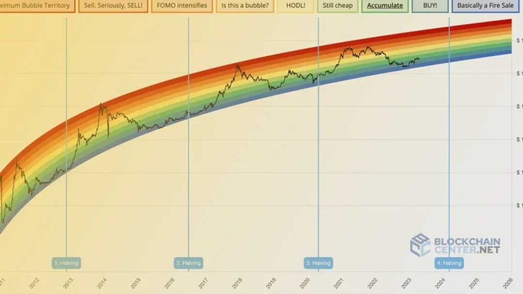
What is the Bitcoin Rainbow Chart?

Introduction: The Bitcoin Rainbow Chart is a tool for long-term valuation that provides a visual representation of the price changes of Bitcoin over time. It does this by utilizing the colors of the rainbow.
- One of its fundamental characteristics is that it is a logarithmic price chart. That means is, it depicts the price of Bitcoin on a logarithmic scale in a way to more accurately depict. It is for its long-term growth trajectory. There is a series of color bands superimposed on the chart. In which all of the bands represent a distinct phase of the Bitcoin marketcycle.
Explain How the Bitcoin Rainbow Chart Works?
- To create the chart, a logarithmic regression curve is used to the data that has been collected over the course of several years. Afterwards, this curve is color-coded into bands that range from blue, which represents the lowest, to dark red, which represents the highest.
- The position of Bitcoin within these bands might provide you with a fast glimpse of whether it is thought to be overvalued, undervalued, or somewhere in between based on past trends. Each color band represents a different price range. Within these bands can vary, It also includes the position of Bitcoin.
- A dark red indicates that the market is significantly overextended, and it is likely that the price will decrease.
As a result of the overbought condition of the Bitcoin market, traders will consider taking profits.
- A dark orange color indicates that buyers are in control of the market, and the fear of missing out (FOMO) is in full swing.
- Light orange, that shows the market is in a state of equilibrium, and there is no obvious indication as to whether it is best to purchase or sell.
It is recommended that investors keep their Bitcoin holdings because the cryptocurrency is neither overvalued nor undervalued.
- Bright green this colour shows that Bitcoin is a very inexpensive cryptocurrency, which makes it a possible option for purchase.
- Green colour shows that this is a fantastic opportunity to add extra Bitcoin to your bankroll.
- Light blue shows an excellent opportunity to make a purchase. There is a possibility that the market has reached its bottom since Bitcoin is extremely undervalued.

Bitcoin Rainbow Chart: Instructions on How to Use It:
- To put it simply, the concept is rather straightforward: When Bitcoin is in the cooler colors (blue and green), it might be a good opportunity to buy. Based on these colors, it appears that it is currently cheap in comparison to the long-term trends. On the other hand, if Bitcoin is trading in such colors (red and dark red), this may be an indication that the market is overheated and that it would be prudent to take some profits.
- It is essential to keep in mind that this Chart is not a reliable source of information. Bitcoin is a very volatile asset, and its previous performance does not ensure that it will continue to function in the same manner in the future.
- However, it is a useful tool for just having an idea about long-term trends. Due to the fact that the chart is derived from historical data, there is no assurance that the price of Bitcoin will continue to follow the same patterns in the future.
Bitcoin’s Rainbow Chart and the half of the cryptocurrency
There is another essential component of the Bitcoin Rainbow Chart. It is the way in which it is connected to the halving events that Bitcoin undergoes. Once every four years the Bitcoin halving process takes place, this information is for those who are unfamiliar with the concept. This cuts miners’ reward for adding new blocks to the network by 50%.
- The significance of this process lies in the fact that it slows down the rate at which new Bitcoins are brought into existence, which has the ability to generate scarcity and drive up the price.
- Throughout the course of its history, the price of Bitcoin has typically been found in the lower bands of the Rainbow Chart around the time of a halving, and then it has gradually climbed its way up to the higher bands in the years that followed. However, given that Bitcoin has only ever undergone three halvings in its entire history, it is essential to keep in mind that this pattern may not continue in the future.
- Some cryptocurrency tax calculator, has created an infographic that explains the halving of bitcoin and how it affects mining payouts.
On the Bitcoin Rainbow Chart, who is responsible?
An individual who goes by the name “Trolololo” on the Bitcoin Talk forum was the one who initially presented the Bitcoin Rainbow Chart in the year 2014.
Since that time, a few individuals who are part of the Bitcoin community have been working on improving the concept, which has led to the Rainbow Chart that we are familiar with today.
As a method of visualizing Bitcoin’s long-term price trends, it has acquired appeal, despite the fact that it was initially developed as a tool that was some what tongue-in-cheek.
The Bitcoin Rainbow Chart is currently available on a variety of websites, including Blockchain Center and TradingView, where it can be visualized.
What is the accuracy of the Bitcoin Rainbow Chart?
Although the Rainbow Chart is a helpful tool, it is not unfailing in its accuracy. It is founded on past facts and assumptions, it is possible for it to offer valuable insights; nonetheless, it should not be the sole aspect that guides your decisions regarding investments. The market is affected by an infinite number of factors, the color bands do not accurately reflect the current state of the market or the forecasts for future prices.
Having said that, the chart can still serve as a useful reference point, particularly for individuals who are interested in gaining an understanding of the potential position of Bitcoin’s price within the context of its larger market cycle. It is important to keep in mind that, just like any other tool, it serves its purpose most effectively when combined with other ways of analysis and indications.
How to include the Bitcoin Rainbow Chart into your overall plan
Consider including the Bitcoin Rainbow Chart in your toolset if you are an investor or trader. It can be an extremely useful addition. There is a possibility that it would be beneficial to consider accumulating additional Bitcoin when the price is in the cooler zones. On the other hand, when the price is in the warmer bands, it might be time to consider taking some profits. This is true when the price is in the warmer bands.
Conclusion:
So, However, keep in mind that the chart should be regarded more as a pointer for the long run rather than a trading indication for the short term. In the short term, the price of Bitcoin can be extremely volatile; therefore, it is essential to keep the bigger picture in mind and to avoid getting too caught up in the little swings that occur on a daily basis.

I’m Manak Ahuja, a business administration graduate with a passion for digital marketing. With experience from my family’s business, I understand how to scale in competitive markets. My entrepreneurial spirit and digital marketing expertise drive me to create growth and innovation. I’m excited to continue my journey and make a significant impact in the field.


